
Heads up. I am going to start selling off paintings to help with school costs. Take a look at the things I have posted on here since we started. Unless I have stated that I plan to continue working on the painting, you can pretty much assume it is for sale. If you are interested in any of these let me know. These are student works and will be priced as such.
Here are some more of the pics from finals...these are things that have not been posted in their "final" state.
Here is one of my final projects and I think one of the most successful and challenging paintings I have done so far. It is a self-portrait done without using photo reference. I thought my paint handling, use of color and shape all really began to come together here. Of course, I did make some mistakes. As usual, I made the head too big. In some areas I needed to create better transitions. I would have liked to pull the paint strokes around the forms differently as well. I plan to sand out some of this and repaint. 
This is one of my pieces for finals. I have to say I was very pleased with how this painting turned out. It took about 9 hours and I really felt as if I was painting here. I would have liked to have been less timid during this painting. I am sure that I could have covered much more ground since my time with the model was limited. It is for sale.
This was a fun experiment. I was really much more concerned about blending mediums and using powerful colors than I was about the subject matter. This is cut paper, acrylic, gesso, pastel, black and white ink on illustration board. Also for sale.
This painting was quite a long figure study and even though it has become rather blended and many of the powerful colors I used have been lost, it taught me how important it is to keep strokes and colors fresh and powerful. Those are the attributes which will give a painting its depth and wall presence. The major mistake was that I oiled out before the painting was dry enough. I will be using retouch varnish to prevent this kind of error again.
This painting was a modest little still life that I set up to practice identifying color relationships and portraying them in the correct value key. After the previous debacle in still life class, I chose to do something simple and without any preparatory drawing or underpainting. The previous project taught me that it's important for me to make mistakes and paint over...I cannot become rigid or precious about my work. I still need lots of room to make discoveries. Also, also for sale.
Oil paintings from finals at PAFA
Value Studies
One area of color that I really struggle with is value (relative lightness or darkness of a color). Over the past summer, I worked on a series of simple value studies to improve my skills. Since color is so complex, I started by working only in black and white.
I used basic shapes in my set ups, like eggs, light bulbs, and wooden spheres painted white etc. I premixed a value scale on my palette (series of steps from pure white to pure black) and began painting.
To some people this may seem boring or tedious. However, I highly recommend black and white studies to anyone having trouble with values.


Portrait Study

Hey everyone. I dont know how many of you are going to keep working over the winter break but I am determined not to let myself become rusty.
This is a alla prima portrait done within 90 minuets during a session of the Dirty Palette Club. I found myself struggling off and on most of the time. The two biggest issue I found myself doing were over blending the paint, making everything muddy, and worrying about smaller shapes to early. My lack of patience lead me down the wrong path yet again. Bigger shapes first, then smaller ones, not vice versa.
I also need to think before i apply or mix my paint. This is the reason for my muddy colors and over blendeding.
Clay, Clay, Clay
Hello everyone,
This is my first post on the blog and hopefully not my last. This post contains pictures of
a clay figure done in Rob Roesch's figure modeling class. I went into this class expecting to hate it, due to the previous stories i have heard, but actually this class brought a lot to the table. Rob gave his students the freedom to just go at the figure and let our personality's soak into the clay, creating individitual creativity. My goal during this sculpture was to add something that sparked the viewers interest while holding as true to the anatomy as best I could. For my second sculpture, I feel that it turned out ok. The anatomy is not strong, but I will fix that in the future.

The Fog Clears...


Well, just one day after the end of the semester, and I think I'm ready to go back. Anyway, I figured I'd share my exploration into over-sized painting. The following images are a documentation of a seven by four foot still life I took on during my Advanced Still Life Class. While it's not quite finished, a bit was accomplished. I will most definitely return to this painting in the near future. I'll apologize off the bat for the poor quality of the images taken with my cell phone.
For the record.
Here is the only record of my efforts in Figure Modeling with Rob Roesch. I took these pics because I had to destroy this :( Not everything we make is worth keeping.Despite the fact that my friends warned me that I would not like this class, I had alot of fun. I learned quite a bit from Rob. Sometimes it is a really good thing to confront yourself with views you do not necessarily agree with.I cam out of that class very much aware that some criticisms of the academy are accurate. We do tend to produce work that looks very much alike because of the rigorous, academic nature of the program. However, I also came out of that class very much aware that creative exploration, without a foundation of academic training or skill building, can produce work that is contrived, unfocused and naiive. It was a very timely reminder for me in both ways. Anyway, here is my last effort which probably suffers from a bit of each of those failings. 


THese pics should be better quality. I hope to be capable of editing again soon....sorry that they're sideways.I am still working on pictures of the semester overview and my biggest "success".
Study...
Hi Everybody!

Hi everybody! Just wanted to make my first post a quick one. The image to the left is a recent image from the Studio Anatomy class that I'm enrolled in. Not much to look at, but at least I'm learning something. :-P Oh, and thanks Dave for inviting me! Later everybody.
Home Stretch
The fall semester will be ending in just over a week. My final projects are due and I am working hard to get things done. I am really looking forward to the winter break. Hopefully, I will have a chance to focus on my painting.
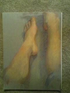
My figure study was lit by soft, cool, natural light. It is a big change from eye straining fluorescent bulbs and bright spot lights. I am amazed at how the lighting alone changes the entire feel, value, and colors of a painting.
I truly enjoyed trying to capture the beautiful purples, pinks, blues and yellows that showed up in the model’s skin. Looking back on what I have learned, I wish that I had cropped my subject in a different way. However, I am pleased with the way some of my colors turned out.
Back from the dead


Sorry. I will do better. I can't do anything in regards to the picture quality yet. I'm workin on it. These are still cell phone pics.
All of the figures are done from life with lots of palette knife work. I wish I could rotate them for you...sorry guess you'll just have to turn your head sideways. I'm pretty happy with how I'm handling color these days. It's been a real fight through this smester but some things have really started to sink in. One of my finals is in this post but the quality of the image is so bad you can't see the major improvements. I will be putting up a post next week using better images...I think I figured out how to do it. Stooopid library kompewters. Anyway, enough griping. The major thing I've learned is that it is a very bad policy to modify edges on your brush strokes with impunity. It isn't that it will create too many soft edges, it's that the colors it creates are muddy and boring. Muddy is the word for this semester. Richard Schmid calls that range of boring brown/neutrals, muckledy-dumb brown. I have found that I can create much more interesting transitiions and a better sense of form by tiling or placing clear storkes of clean color next to each other. That's part of the reason I resort to using palette knives. It is also the reason behind people advising me to work larger all the time. It gives you room to make those transitions without blending. Of course, I thought I knew all of that and understood it though I still wasn't doing it. I think I have come a long way toward applying that information now... but I'm stubborn. Such is my life as a student. I relearn, restate and try to remember but I end up rediscovering the same lessons again and again...each time its a profound revelation.
One other important skill I've been struggling with this semester, is developing color and value relationships. So far, I am grasping the concept by thinking of it as a method of triangulating and palette organization. I try to mix several colors at a time and put them right next to each other until they relate the right way. My main concern will always be value. I'm really slow at it this process right now and my biggest failing is that I do not have the patience this process requires...yet. I beleive this is a matter of discipline and practice. I have to trick myself into that sort of stuff..
Next week! Final projects and an overview of my biggest successes this semester.

