Figure Comp

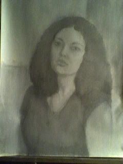
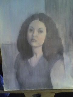
Here's just a quick post on my progress so far on my final in-class painting for Figure Comp. I started with a transparent grisaille underpainting, then blocked color in. I tried to use shots of purer color in the flesh because I like the way it reacts with the greys underneath, dulling it, but not necessarily deadening it.

Portrait Studies

The human face is an amazingly powerful window of expression however, it is an area that I always seem to neglect. Thankfully, in my Anatomy Class we have been focusing on the head and face.

Here are some portrait studies that I made during class. All of these studies were done lightly in pencil, so unfortunately they did not photograph well.

Small pen drawings

I think the title says it all; I've been working on small (around 11x14) drawings using ball point pens. Soon I'd like to try going bigger, I'm just wondering how the thickness of the line will relate to something larger...only one way to find out, though, right?

So these are mainly from my portrait class with Sidney Goodman and the last two are from the drawathon.


Pallet Knife Studies

Along with my many pastel studies, I have also been experimenting with pallet knife painting. I love the clean stroke of color, the gestural mark and thick layer of paint that you get when painting with a pallet knife. Here are some small studies that I have been working on. (Not all of them are completed.)

This oil study was lit with natural light.

This oil study was lit with a spot light.


ecorche, large scale figure in oil, pastel


So, I lost track (which happens to me far too often) and it's now been a month since my last post. What have I been doing? Arguing, whining and complaining...mostly at myself but, also far too often at my friends and teachers. It's just that I'm stubborn and I when it suits my fancy I will delude myself. I've made an "art" out of it. It's like I'm chasing a detail to the detriment of the larger picture...:)
Seriously though, too often I look past the truly important parts of picture making and become entranced by the pretty flourishes or sparkling details. You know, "Oooh, aaaaah...shiny....pretty...." In fact, I can become so obsessed with "how to paint" that I ignore the truly important issues like...I dunno...mebbe making a pleasing picture?! Oh yeah, I am supposed to be making pictures not just drawing or painting. Funny how that slipped past me there. So when I say that some of the paintings in the last post "failed"...I don't mean that they were horrible. In fact, I quite liked them. The point is, that I need to be doing more than just painting well. Anyway...here's some more pictures...

Oil Paintings, flowers, portrait, still life


All of these pieces fell short in one way or another. So, these first two never even made it out of my studio.
This painting was supposed to be for the Art of the Flower show at The Philadelphia Sketch Club. Unfortunately I never finished it.


This still life was also never finished.


This was a modeled underpainting experiment that never got anywhere.


Here's a finished one! This is a portrait of Chuck that I entered into the last show. Unfortunately, it was rejected :(


From Blocking things in...

This last one is a drawing I did in Scott Noel's class back at the beginning of the semester. I hid it as soon as I could.

Figure Composition

One class this semester that has been helping me a great deal to think about the painting as a whole is Figure Comp with Doug Martenson. Often I find myslef zooming in close to my subject and proportioning my support around that, but in this class I get to really focus on backing away from it and making an environment around it. We have just begun our third and final pose and so far I have just worked on planning the composition. Here are the first two paintings (the first was a short one that was not completed and I'm hoping to work more on the second at home) and the drawing for this final eight week pose.

When I work on this more I will definately focusing on developing values as well as bringing up the intesity of certain colors and variating the hues of the greys in the background.

(Sorry if this is difficult to see) My plans for this one is to first do a value study because I have noticed that my values are much weaker when I skip that part. Looking at it, I think I also want to do the head of the figure in the chair from a different view because at the moment it is looking like a copy of the figure standing's head.

Also, still alive - Head Structure Assignments


It has been a while, and so far I have been trying to keep up with new assignments. I am enjoying the freedom of second year, and have the following work from Head Structure. The first is a master study, during which I learned that mixing color under incandescent lighting can have undesirable effects. I had a terrible time matching, but overall it was good practice.


The next is in-class work, completed from the model, and worked with more paint in the light mass.

Lastly, homework assignment that started out as a self-portrait, but kind of morphed as I worked on it. The photos here aren't terribly good, but I'm still fussing with it at home, trying to see what I can do with lighting and clarity. The same problems cropped up with working in the dark, however, and I'm not sure what to do about that right now.


Suggestions are, of course, welcome.

Pastel Studies


I apologize for my long absence, but I have been without computer for a while. However, I have recently gotten a new one and am ready to post again!

As I was in my last post, I have been experimenting with pastel and trying different techniques of laying down color. The first is a quick study of apples I did a while back, using a pretty direct way of applying color. The last two self-portraits are a work in progress in which I first layed in a fairly basic value structure then am slowly adding color to. This is very early into it and I am planning to get much stronger color, but it shows the idea behind it. I'm hoping that this technique will help me keep a good sense of value while my color evolves, since this is one of my major weaknesses. (Sorry for the angle of the last picture)


Surely, I'm still alive and kicking...

... well, at least kicking. It's been a while since I last posted, and hopefully this will be the last time there will be such a lull from me. Onto the first specimen! A recently completed (sort of) portrait from my Anatomy Class. Technically, I was surprisingly pleased with the outcome, especially because I have a hard time thinking of tone in a formulaic classical way. In terms of likeness, well... I made him slightly more feminine than he really was. Okay, a lot more feminine. Take a gander for yourself:

The following two pieces are from a life drawing class that I'm currently enrolled in. I do have to say, I enjoy Scott Noel's approach very much and I can better relate to what he's teaching than some of my other drawing classes. I think these images speak for themselves:


And this final piece I'm posting is a travesty against every watercolor pencil drawing in the history of art. However, I kinda like it:
Well, that's it for now. I'll try to get another post up within the same month. Can't wait for advising next week!

Random Tidbits

Here I am, posting yet again! Today I have a bunch of random little studies and exercises from last semester which I'd like to talk a little bit about.


The first two are both from my Advanced Still Life class from last semester...now I chiefly worked on a very big project in that class which I will be posting about very soon, but I tried to also do lots of quick little studies in that class as well. I did not end up doing nearly as much of that as I would have liked, but here are two of the quick paintings which I did do. The first was just a little grisaille painting...I had intended to work it in color in a three hour session or so, but I got so carried away by the underdrawing and underpainting that I decided to leave it simply as a value study. I think I probably spent 2 to 3 hours on it in total.


So, since the last one didn't work out quite as planned, I decided to do another study of the same subject, this time focusing on color. My teacher, Jan Baltzel, made a really excellent suggestion for this one; she said in order to avoid getting carried away with an underpainting again, I should begin by identifying and mixing the colors in the set-up...that way, before I even begin drawing or anything, I am thinking about the painting in terms of the colors there. I found that to be incredibly helpful, and for this painting, I spent probably the first 45 minutes just mixing colors and trying to get all the little subtle color variations in the apples. I have to say, this photo really doesn't capture the colors well in this painting at all unfortunately; it came out with a much yellower cast to it than the painting actually has. Anyway, I probably spent a total of 3 to 4 hours on this one.


The next few paintings are all exercises from my Materials and Techniques class with Anthony Ciambella. That class was such a blast, I really really enjoyed it and I think I learned a ton from it. Anthony is a great teacher; he's incredibly knowledgeable and very funny! With any technical issue that you might be having in your paintings you can just go to Anthony and he'll have an answer for you, from a conservator's point of view, so you know whatever he says to do will be "archival".

This first painting was just a quick little exercise in acrylics...I worked in acrylics first before I started painting in oils and I absolutely hated them, so it was kind of fun to go back and try acrylics again. I still didn't really like them at all, but at least now I felt much more comfortable working with them, and I can see how the quick-drying aspect might be useful in some ways.


This next one is the glazed over version of the grisaille underpainting which I posted a little while ago. We were supposed to have at least 3 to 4 layers of glazes on our paintings which I did...in some areas there are probably more. It was really fun just being able to experiment with layering different colors; my goal was to try and achieve some really subtle little color shifts...again unfortunately, the photo really doesn't capture the color all that well.


Again this is another glazed over painting...you can see the original underpainting here. Again there are about 3 or 4 layers of glazes on this...I tried to see how rich and vibrant I could get in some areas...I think it would be fun actually to continue glazing with this one and see how many layers it takes to get really striking reds and blues and greens. I know various people have said that with glazed paintings you are still really only getting started after 40 layers...


This last one was my "mixed media" project for that class...I really had no desire to do some kind of abstract mixed media piece like most other people were doing, so I decided to turn it into something that I was interested in. I became really fascinated by the end of last semester with trompe l'oeil painting, particularly the paintings of John Peto and William Harnett. I am definitely interested in taking my paintings in that direction in the future, and I used this as an opportunity to experiment with that. My idea with this was that half the objects would be painted and half of them would be real, and the goal was that the viewer would not be able to tell the difference. Because of time constraints I was not able to paint in quite as much as I would've liked, but I think it was still fairly successful. Can you guess which are painted and which are real?


Ok, in case you couldn't, the white string on the upper right, the black and white photograph, the yellow piece of paper, and various nails in the wood are all painted. The rest are real objects tacked on a wood board.

Alright, folks, that's all for now...I think my next post will get me completely caught up to date, and then I'll begin posting about this semester! Till next time!